Royal Stamp Blog

How to Remove Unwelcome Parking Guests - Private Property Parking Signs for Your Building

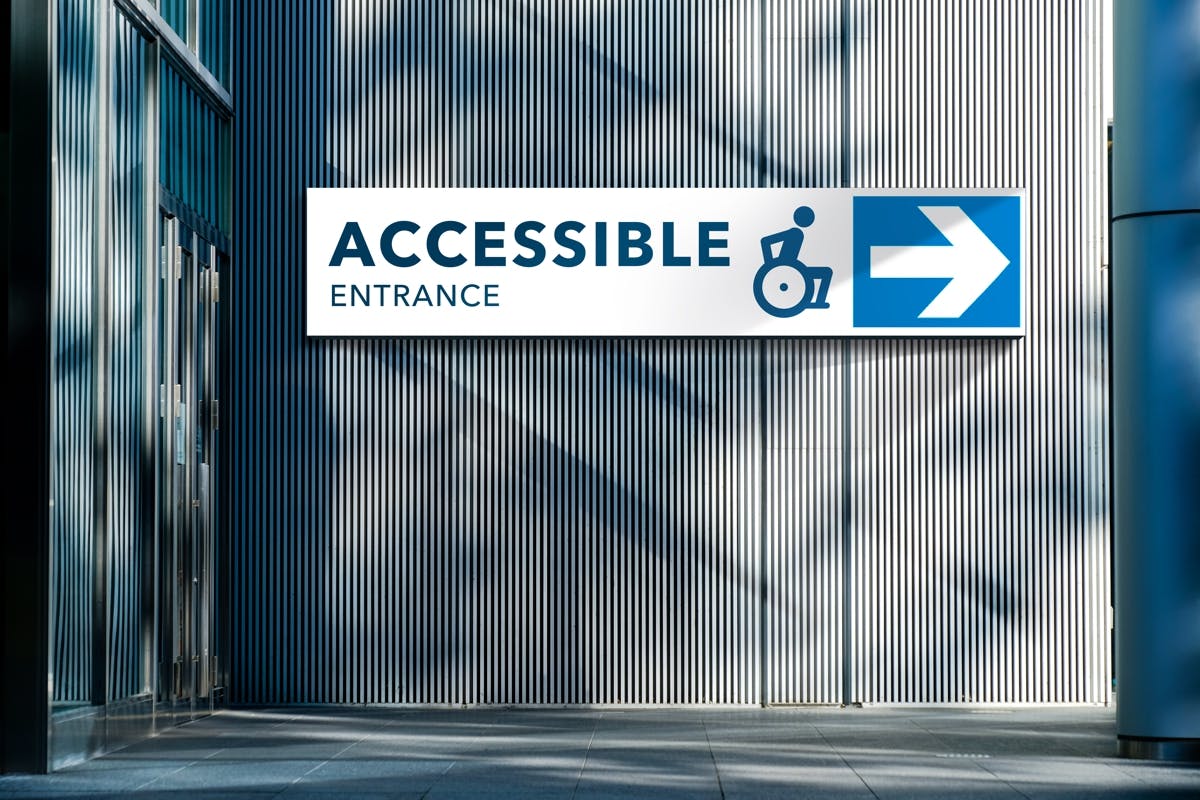
Although most of our signs are custom made to our clients specifications, one of the most popular stock signs that we carry are City of Edmonton Private Property Parking Bylaw signs.

We hear many stories from our customers about how the authorities will not remove vehicles because there is improper parking signage. No worries! We are here to help.

Our stock signs have the official  wording as per the City of Edmonton Private Property Parking sign requirements. We stock them in the recommended 24” x 24” size as well as a 12” x 18” and you can pick them up same day at any of our 3 locations. We can also create a custom sign with your property name or other wording in just a few days.

Here is some other information you may not know about:

- 2 Private Property signs should be posted at each entrance

- When installing, the lower part of the sign should be 6'6" above ground level

- A site inspection can be arranged with the City of Edmonton if you are unsure of placement etc. Call 780.496.5174

Pictures of our parking signs can be found here. Please call or visit us if you have questions. We promise we won't tow your car.

Posted on August 21, 2013 - 1:12pm by Yung.

A new website, a new logo

When Ray Hopkins opened Royal Rubber Stamp & Sign Co., he could not have predicted what the venture would evolve into nearly 56 years later.

Our original logo, featuring a stylized rubber stamp and original font, took to heart the mainstay of our business when it was in its early years. Royal Rubber Stamp has been known for its rubber stamp production and there are some people that still recall seeing the “rubber stamp car” driving the streets of Edmonton.

Since then, our business has grown exponentially to encompass all aspects of sign production and installation.

To meet and further this growth, we decided it was time to revamp the visual identity of our business through the creation of a new website and accompanying logo. Our vision was simple: create something clean and modern, yet classic and recognizable.

Staff members drafted more than 50 logos, with the final logo submitted by Production Manager Jim Avery. The three shapes on the left side of the logo represent stylized signs, our three branches and the three main stages of production — concept, fabrication and installation.

Although we decided to leave the rubber stamp out of the logo, we wanted to retain the spirit of the old logo by incorporating the royal blue colour into the new design.

We’re still the same great company that has been serving Edmonton and Alberta for more than five decades. We may look different on the outside, but we are still the same family-run business that Ray Hopkins created in 1957.

We look forward to showing you our new look and helping you create yours!

Posted on May 26, 2013 - 1:04pm by superadmin.

Pages

Subscribe to Royal Stamp Blog